Neighborly - the Buy Nothing app

1.0 Abstract
Neighborly is a mobile app concept, inspired by the Buy Nothing Project; a nonprofit that uses Facebook groups to help connect people, living within a 5 mile radius, and support them in giving away secondhand items to each other. These items are referred to as “gifts”. This project was developed for the DePaul Capstone class.
We conducted early research interviews of users that were involved with the Buy Nothing Project in their area. Based on learnings from our interviews, we created an interactive prototype and tested it using expert reviews and usability studies. We used the feedback from the usability studies and reviews to refine our designs. Finally, we conducted a follow up usability study to determine if there was a notable improvement in our iterations.
By comparing the overall satisfaction rating of participants with the first design to the satisfaction rating of the revised design, we determined that we were able to modestly improve satisfaction.
We also conducted a needs assessment survey and determined that respondents often give things away that they no longer need. Additionally, respondents feel that it’s important to know the people that live around them. Due to these and other factors, we believe that there is a market opportunity for Neighborly.
While overall satisfaction was high, we still believe there is work to be done. Particularly in the area of sending public comments and private messages.
2.0 Project Goals
We set out to focus on creating successful designs for 3 major workflows:
- Posting a Gift: We originally envisioned a series of activities relating to managing a gift, but it became clear that handling all these activities would be beyond the scope of this project. Therefore, we decided to focus on the interaction of posting a gift and creating a “Decision Maker”, which is a feature that helps the Giver select a Recipient.
- Requesting a Gift: This interaction focused on the Recipient and the process of requesting a gift.
- Handling a Transaction: Managing the details of a transaction between Giver and Recipient allowed us to ensure our designs scaled between Giver and Recipient naturally, without any broken points in workflow.
Midway through the project, we decided to add market opportunity research to the group’s goals. Through the use of a survey, we wanted to determine if potential users did, in fact, have a need for an app like Neighborly.
3.0 Project Methods
Interviews and Documentation Review
Early research was done by examining Facebook groups and the official website for the Buy Nothing Project mission. The project’s mission focuses on creating a hyperlocal (within a 5 mi. radius) community where you Neighborly 2 not only get to know the people around you, but also give away, lend, or share anything that you no longer need. The Buy Nothing mission statement includes tenants, such as:
- “We value people and their stories and narratives above the ‘stuff’.”
- “No buying or selling, no trades or bartering, no soliciting for cash.”
- “We view all gifts as equal; the human connection is the value.”
- “We express gratitude.”
Buy Nothing members are currently connected via Facebook groups. These groups are invite only, are heavily moderated and organize users based on their distance to each other. New members must be approved by a moderator before being allowed to join the group, and can only post an item once they have become an official member. Two team members joined a Buy Nothing group and interviewed its members using an interview script ( Fig. 7.1 ). The script asked high-level questions surrounding the experience of participating in Buy Nothing groups. One team member made numerous attempts to contact Buy Nothing groups, but being outside of their local areas made it difficult to contact users directly. This highlights the groups’ strict regulations and concern for hyperlocality.
Early Conceptual Sketches
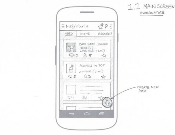
Based on these interviews, the team created several early conceptual sketches ( Fig. 7.2 ). The need to honor the Buy Nothing values was set as the primary objective. Sketches focused on creating interactions that allowed members to interact with one another, while helping to simplify the gift-giving process. Beginning sketches focused solely on mapping interactions, while advanced sketches began incorporating the Google Material Design guidelines. For the remaining interactions and prototypes, the team relied heavily on Material Design guidelines to influence design decisions.

Prototype, Usability Studies, and Expert Review
Once the process flows and design guidelines were established, the team moved into high-fidelity prototypes. Interactive prototypes, created in Axure, focused on completing three full workflows. Each team member conducted an over-the-shoulder usability study, following a predefined script, and asked participants to complete a series of tasks, first as a Giver and then as a Requestor. These tasks included:
- Identifying the parts of the interface
- Posting a gift: Creating, adding a title, description and two pictures to a post
- Adding a Decision Maker, to help choose a Recipient
- Finding a gift to request
- Submitting a gift request: Sending a message
- Identifying the fact that they have received a gift
- Accepting the gift
- Messaging the Giver to let them know when they would be coming to pick up the gift
- Receiving an alert that they have yet to pick up a gift
- Confirming once the gift has been claimed
- Sending a thank you note to the Giver
The first version of the prototype was also submitted to the DePaul HCI 590 class for an expert review. Expert reviews were conducted on the first two interactions, but not the third. Testing was done asynchronously, with instructions visible on the screen at each step of the process. Participants then submitted their comments via an online forum.
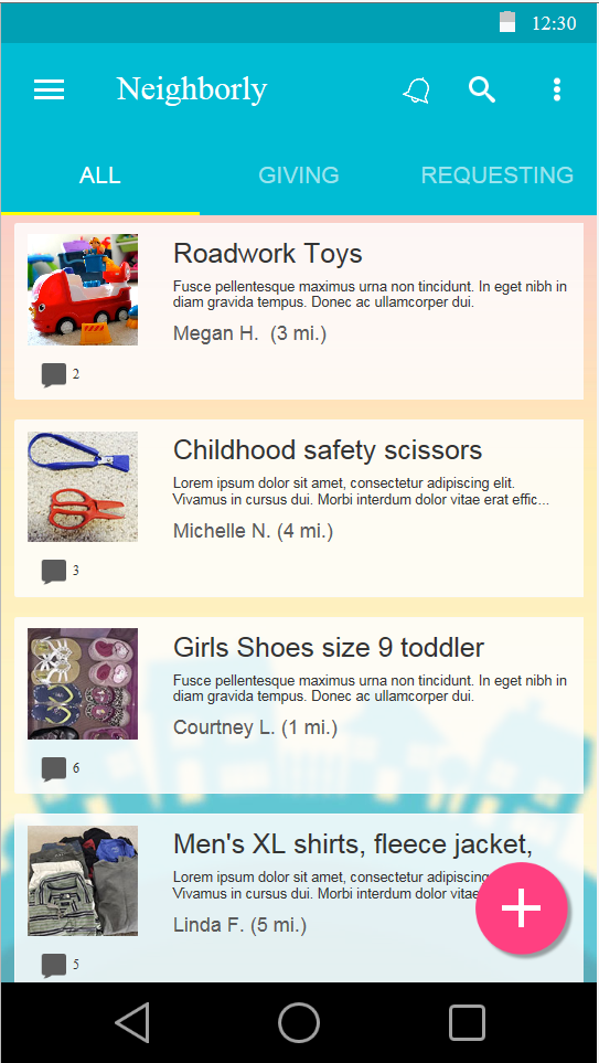
Based on the feedback we received from both usability studies and expert reviews ( Fig 7.3.4 ), we created a second iteration of the prototype ( Fig. 7.3.5 ). This iteration kept many of the same functions, although two major interactions were changed.
Once these changes were made, a second usability study was completed, with four new test participants. The testing script was altered to reflect the new interactions, but was otherwise unchanged.
After both rounds of usability studies, participants were asked to fill out an exit survey, which rated their overall impressions of the the Neighborly app.
Needs Assessment Survey
In order to determine whether or not there was a market opportunity for an app like Neighborly, we decided to distribute a survey that asked respondents to rate behaviors and values that were consistent to the activities supported by Neighborly. For example, we asked questions like:
- How important is it to know the people that live within a 5 mi. radius (or within your apartment complex)?
- How often do you give away things you no longer use?
- When you want to give away an item you no longer use, how often will you ask someone in your neighborhood (or apartment complex) if they would like to have the item?
Each question was rated on a 5-point Likert scale and the survey was distributed through our individual Facebook accounts.
4.0 Results and Findings
Early Research Interviews
We found that members of Buy Nothing groups highly valued the community benefits. One user said “I like to pay it forward” another found it very “gratifying” to give things away. Our early research also uncovered that security and safety of the exchange was very important and not always addressed in Buy Nothing groups.
First Usability Study and Expert Review
The first usability study focused on three interactions; posting a gift, requesting a gift, and handling a gift transaction. We received very positive feedback from our first user test. One user said; “I love the home feed, I like the layout a lot.” Although the first round of users were satisfied overall ( Fig 7.3.4 ), a couple of issues did arise in our user tests:
Giving and Receiving Language in the Navigation
In our first interaction, the main navigation of the home screen was “Feed”, “Gifts”, and “Recipient”. We discovered that the language was causing some confusion. To resolve the issue, we changed the labels from “Feed” to “All”, "Gifts” to “Giving”, and “Recipient” to “Requesting”.
Requesting a Gift
Another iteration involved public and private messaging within the gift detail screen. The intent of the design was to facilitate communication between community members and also between Givers and Recipients. We learned that there was a broken workflow in this interaction, and we missed including a mechanism for private messaging. Our solution was to create tabs for both private and public messages.
Decision Maker
In our first usability tests we found the users were not sure how, when, and why they would use a decision maker. It was unclear that they needed to make a selection on the type of decision maker they wanted to use. One user expressed they didn’t realize a selection could be made. We redesigned the interaction to include a default selection for the Decision Maker.
Privacy Concerns
We heard a few comments regarding privacy. Some users believed that the Giver’s last name should be hidden. There were also concerns about when it was appropriate to reveal the Giver’s address. One user stated, “Most people, when they are posting stuff, they don’t want to have their information up there.”
Pick Up a Gift Interaction
We decided to remove an interaction where the Recipient pressed a button to confirm they had picked up the gift. It also provided an option to send a thank you to the Giver. Through usability studies, it became clear that we should leverage the private messaging feature to handle communications like thanking the Giver. In addition the feature was rated moderately valuable by our expert reviewers. (Fig. 7.3.2 and Fig. 7.3.3)
Second Usability Study
In our second usability study we incorporated the lessons learned from our first usability study and expert review to improve the Neighborly prototype. Additionally, we continually revisited Google design guidelines, to ensure we were using appropriate patterns. Overall satisfaction went up after making the initial changes (Fig 7.3.5), which indicates our changes were consistent with user expectations and may have even improved the experience. However, we still discovered issues in the following areas:
Giving and Receiving Language in the Navigation
Our labels “All”, “Giving”, and “Requesting” continued to create confusion. Many participants believed that “Requesting” would display a list of gifts users were requesting. Our intent was the list would show only the gifts the user had previously requested (by clicking “I want this” on the gift detail page).
Requesting a Gift
Although we changed the interaction to show both public and private messages, our users were unable to distinguish, from the menu alone, which tab was private and which was public messaging.
Decision Maker
The decision making icon and labeling was much clearer, but users began to ask why they would select a decision maker before they had potential recipients for their gift.
Public and Private Messaging
Users could not successfully determine the difference between sending a private and posting a public message. When asked whether or not the message they sent or posted was private or public, many answered incorrectly or could not answer with confidence.
4.0 Needs Assessment Survey
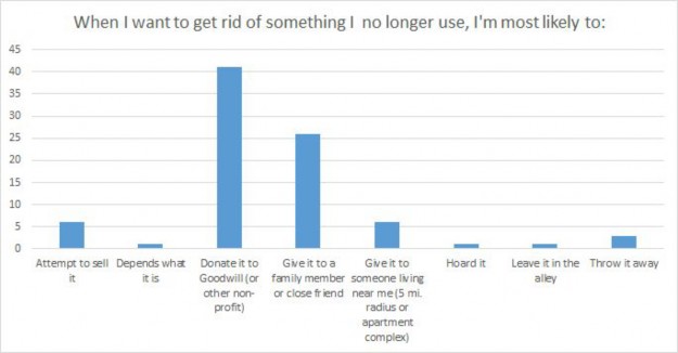
We had an overwhelming response to the survey, with nearly 100 responses (Fig. 7.4). While we cannot, definitively, say that there is a clear market need for Neighborly, there are indicators that suggest people would be receptive to the features Neighborly provides. Here are some high level indicators that suggest respondents could find Neighborly appealing (Scale is 0-4):
- When asked How often do you give things away you no longer use?, 28% of respondents answered “Always” and 43% answered “Often”.
- When asked How important is it to know the people that live near you?, 26% of respondents answered “Very important” and 27% of respondents answered “Important”.
- When asked Are you currently a member of an online group or community, specifically created for your neighborhood (or apartment complex)?, 47% of respondents answered “Yes”
There were, however some indicators that suggest that respondents are not finding value in giving away their used items to neighbors (Scale 0-4):

- When asked When I want to get rid of something I no longer use, I'm most likely to: 7% of respondents answered “Give it to someone living near me” and 48% of respondents answered “Donate to Goodwill (or other nonprofit)
This could indicate that potential users do not desire to give their used items to neighbors or that they have already solved this problem by donating their used goods to nonprofits.
5.0 Conclusion
We’re encouraged that we’ve landed on a design that is resonating with users. We also believe that there is a potential market for Neighborly as the participants in our study demonstrated a willingness to give away items and a desire to know the people living around them.
However, we believe that work still needs to be completed. We’re less confident with our designs around private messaging as our usability studies were inconclusive. We’d recommend further usability studies on those interactions. Additionally, we believe that the selection of a Recipient is a key interaction not covered in this study and should be designed and explored further. Finally, we realize that our interviews, surveys, and research are heavily biased by our relationships with the people we studied. It would be advised to conduct similar research on participants who are randomly selected or have no affiliation with the researchers.
